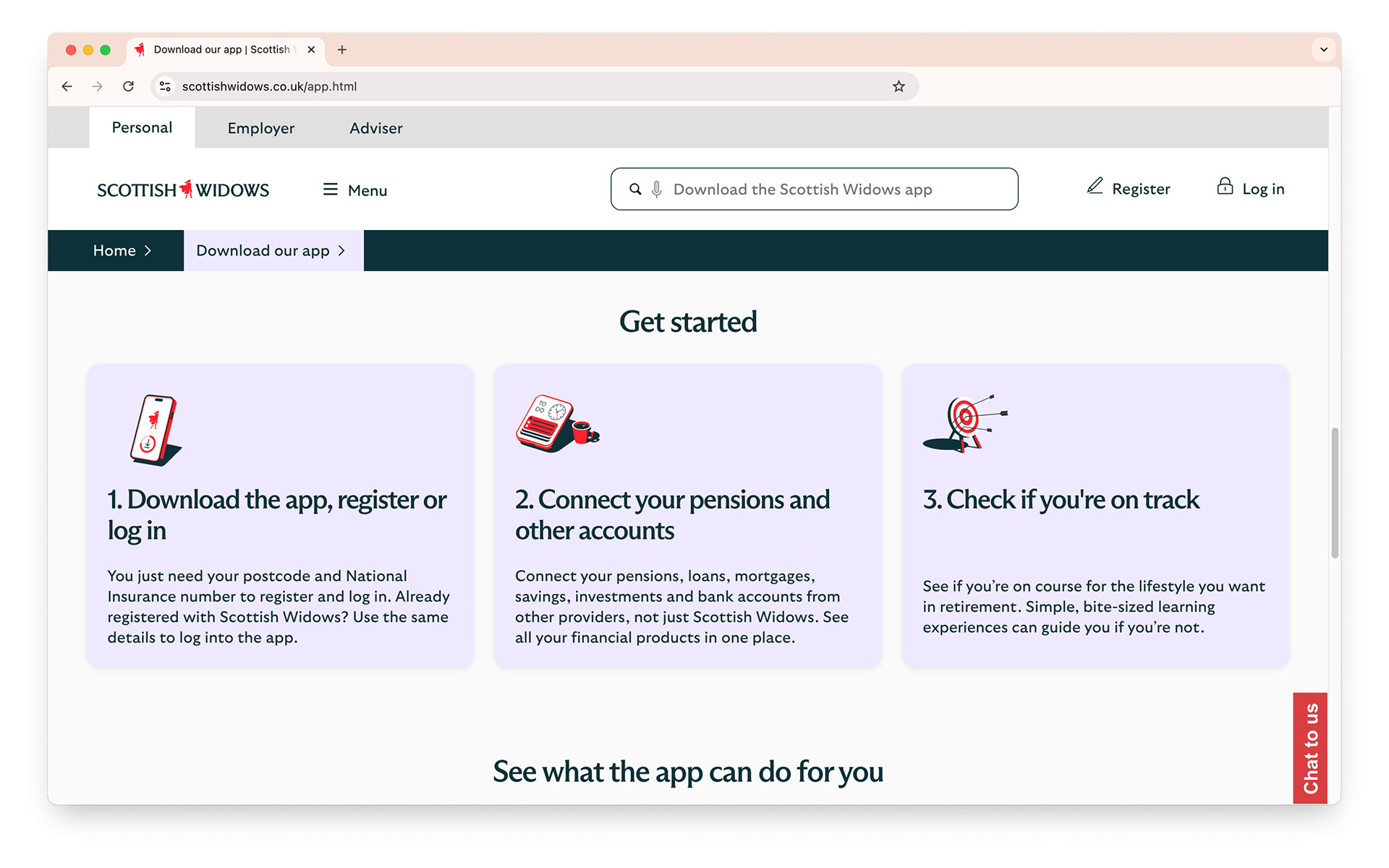
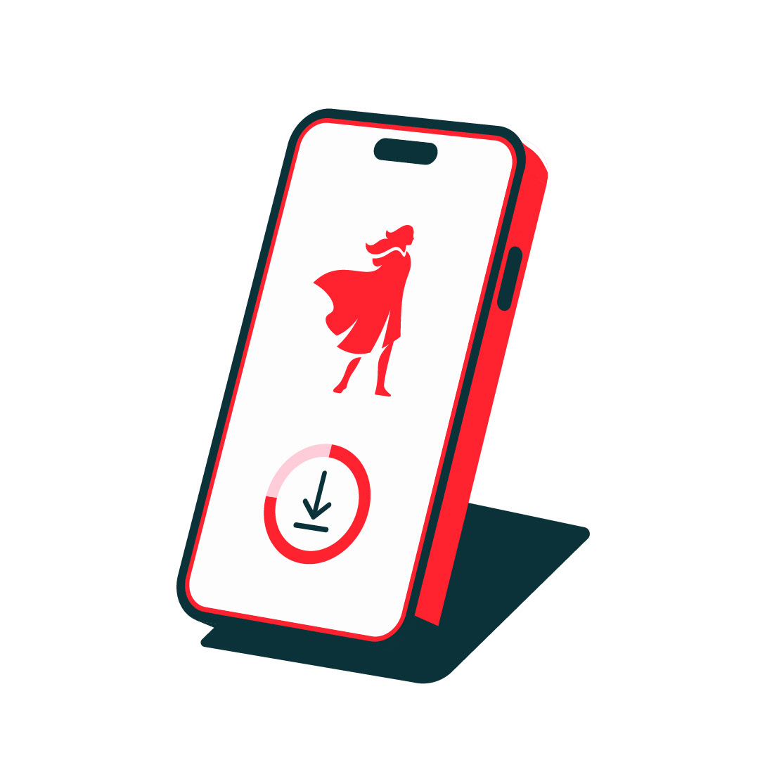
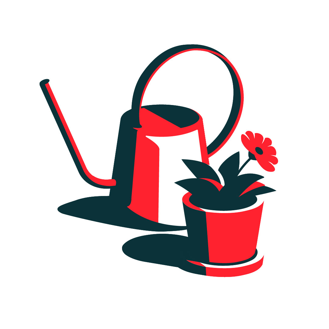
We were commissioned to develop a series of brand illustrations for Scottish Widows.
12 icon illustrations are being used across print/online/in-app to represent various concepts, services and messaging for the brand.
The illustration style we were asked to develop needed to reflect and integrate with the Scottish Widow brand refresh, with their updated design principles applied, and lead with the primary colour palette of red and teal.
All while convaying a sense of premium quality.
Motion was a key asset to each illustration and we added subtle animation to the icons that would play when the illustrations show within the app.


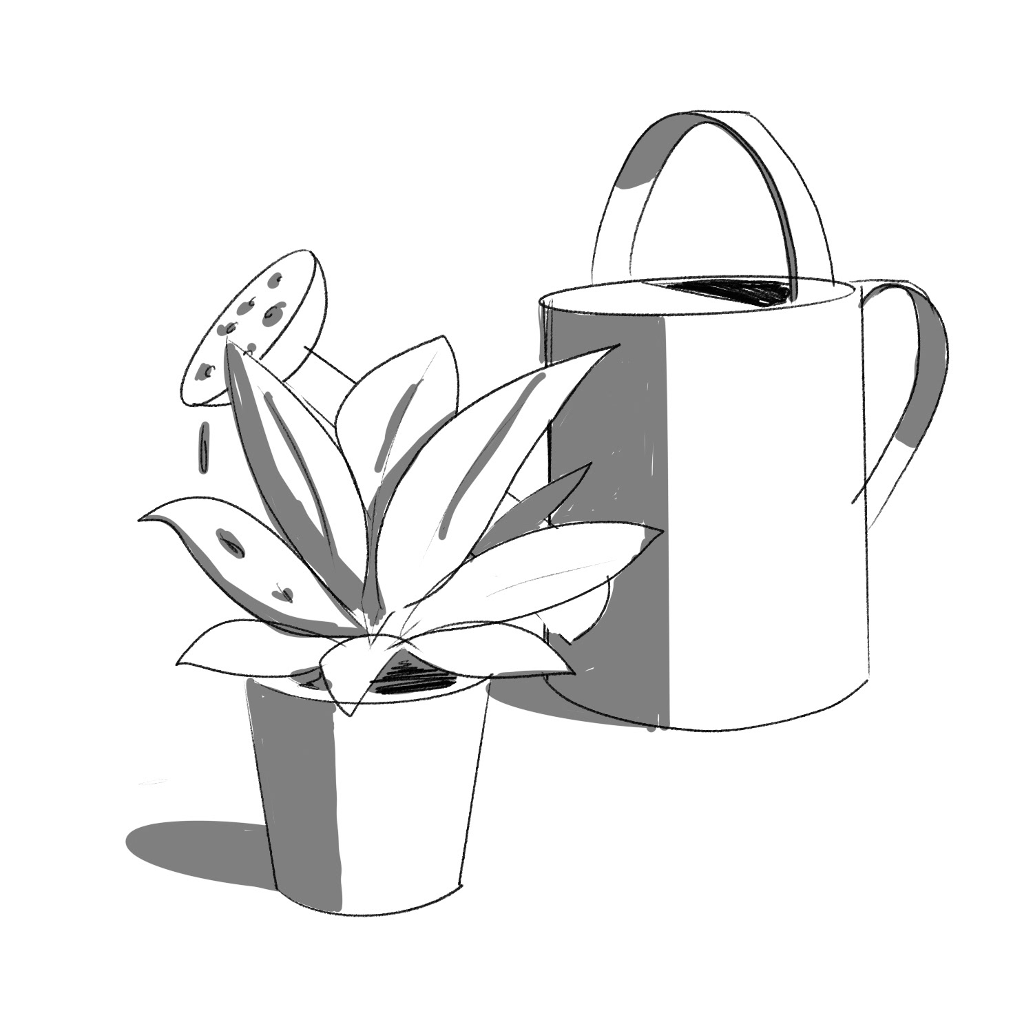
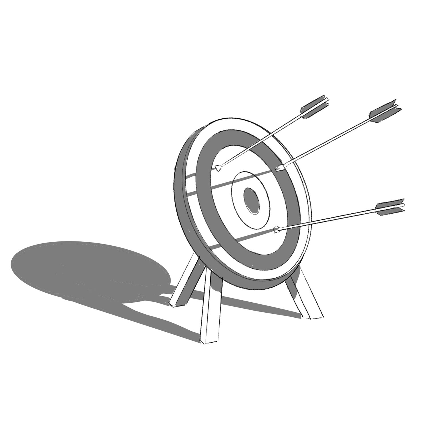
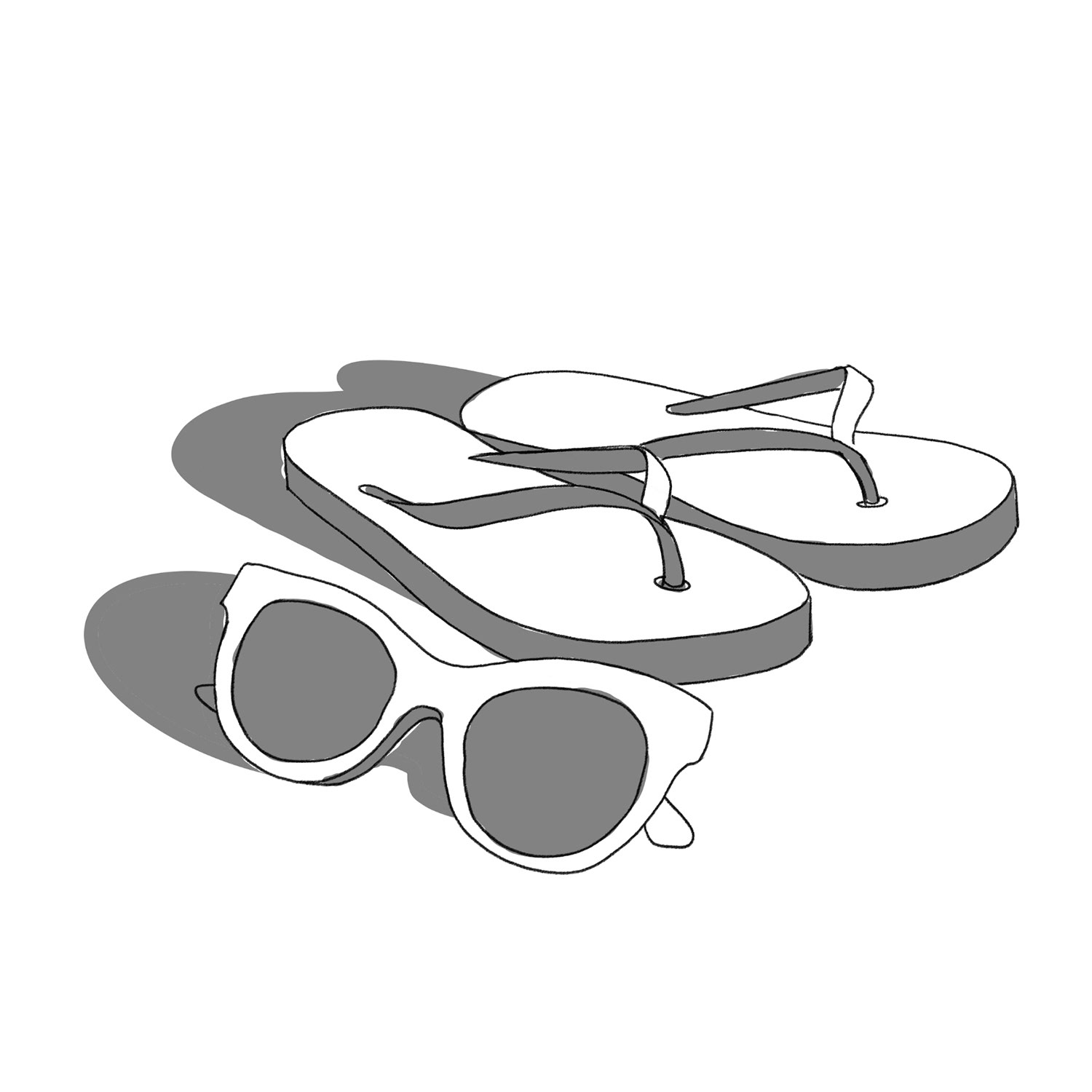
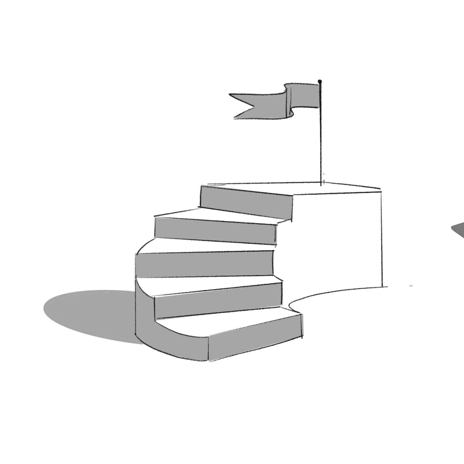
Initial Concept sketches